EDIT: This blog post was featured on GameDeveloper.com on the 18th of April 2024.
It’s been almost six months since the release of The Sirena Expedition, and I’ve been meaning to write a post mortem of the project for a while now. I’d like to talk a bit about the development of the game, and look at some of what I thought went well, along with what didn’t go quite so well. In this post I want to focus on the design of the game itself, and in a second post I’ll look more at the decisions I made around the game; what drove me to make it, how I got it to release, that kind of thing. I’ll try to limit spoilers as much as possible, but I built the game with a couple of main surprises in mind, and talking about game’s design in detail will necessarily spoil these a little. I do recommend playing the game before reading this, if you can.
The Beginning
Comparison between the Game Jam build (left) and release build (right).
For those not aware, The Sirena Expedition started life as a game jam entry, which I initially made in a little over two months. As the response to this prototype was positive, with coverage from Alpha Beta Gamer and a couple of Twitter accounts that cover horror/PS1 games, I decided to flesh the game out into a full, commercial title. I’m getting ahead of myself a little, but I do wonder if this might be the reason for what I perceive as the game’s design failings. I tend to design games with an entire experience in mind, and the game jam build is this; a 2.5D platformer in the style of Pandemonium, but largely narrative-focused and mechanics-light.
However, when envisioning what a commercial version of the game would be like, it felt to me like I needed to lean more into puzzle mechanics. Partly this was a practical decision; I was aiming to make the game about an hour long, and if it had been a straight ‘walking simulator’ with no real pushback on the player’s progress, the amount of new content I’d need to make felt unrealistic to me. As a result, however, the game feels a little less cohesive than it would if I’d designed it from the ground up with its central teleportation mechanic in mind.
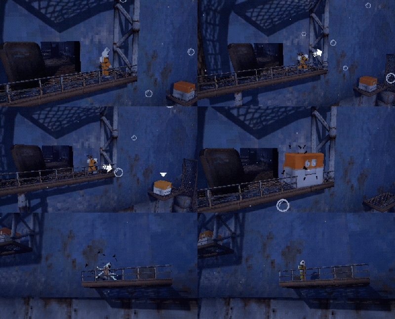
I think I was fairly successful in mitigating this by tying the teleportation skill to a major plot turning point in the game, and generally when I’ve watched videos of people playing it, their reaction is everything I could have hoped for; shock at the aquanaut removing their helmet, followed by surprise that they can now swap places with the blocks they’ve been pushing around. To make this work, I had to mislead the player a little about what the game is in the marketing, by referencing the teleportation as little as possible (there’s some blink-and-you’ll-miss-it footage of it in the trailer, but nothing else). In general I’m glad I did this, but of course there are people who are unhappy that the game isn’t quite what they were initially sold on.
Teleportation
Swapping places with a block.
I think there are a couple of other places where this lack of cohesion is visible, though, which are a bit more problematic. For one, when I started working on the full version, I knew I needed some kind of extra mechanical hook, but I didn’t know what it would be. I had an outline for the narrative flow of the entire game, and this included the player gaining a new ability in order to progress in an area they’d been through at the start of the game, but which was now collapsed and impassable. However, for a few months I didn’t know what this ability would be, and I ended up making quite a lot of the rest of the game before finalising it.
I thought about some kind of air-dash or double jump, but these felt at odds with the rest of the mechanics, and also a little obvious/underwhelming. Teleportation felt like the best fit, and something I could justify narratively, but how to make it something that could be used in puzzles? Allowing the player to teleport freely would have been too hard to implement mechanically, and too difficult to constrain in a way that would allow for interesting puzzle design. Similarly, having fixed points for the player to teleport to or from didn’t seem very interesting, just a case of ‘press a button to go to the next area’.
So, having just added pushable blocks to the game, it felt like allowing the player to swap places with them was my best option. I’m definitely happy with how I implemented the controls for selecting a target to teleport to; it’s easy to learn, feels (mostly) intuitive, and works both with an analogue stick and with arrow keys or WASD (mostly). Outside of that, though, there are things I had to do to make the puzzles work that feel weird and arbitrary, and which could have been avoided if I’d designed the game around the teleportation mechanic from the start.
Limitations of the Teleportation Mechanic
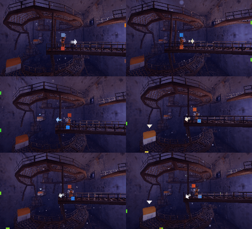
Visualisation of how the teleportation mechanics select a target.
The teleportation mechanic works by having the player hold a button down and push in a direction. This direction is translated into screen space, and I draw an imaginary box from the player’s location to the edge of the screen and find which blocks are inside that area. If there’s more than one block, I do a bit of maths to determine which one the player was most likely pointing at, and make that the current target. When the player releases the button they swap places with this block. Once I’d got all this working and had started designing puzzles around it, a couple of problem points became apparent:
Because of the spline-based nature of the game (you’re essentially moving on a 2D plane, but it bends around corners and splits into different paths), you often have a view of blocks in earlier parts of the level. If you select one of these as your teleport target, you can swap places with it, and you generally end up unable to progress (because the block you swapped places with was needed for progression, and it is now off-screen and you can’t teleport back to it). There is also the fact that block selection doesn’t care whether a target is obscured by geometry or not. As such, you could technically teleport to a block that is completely obscured by a wall, or in one case, outside of the facility when you are inside of it.
It is possible to swap places with a block, and then be unable to see it in order to swap back, due to the fact that the camera rarely looks at the player straight on, but is generally tilted down a little. So, you might be able to see a block that is below you, and teleport to it, but now because the camera is tilted down you can’t see the platform you came from, so you have no way of getting back up there. Basically, every teleport you make needs to be reversible, and that can’t always be guaranteed.
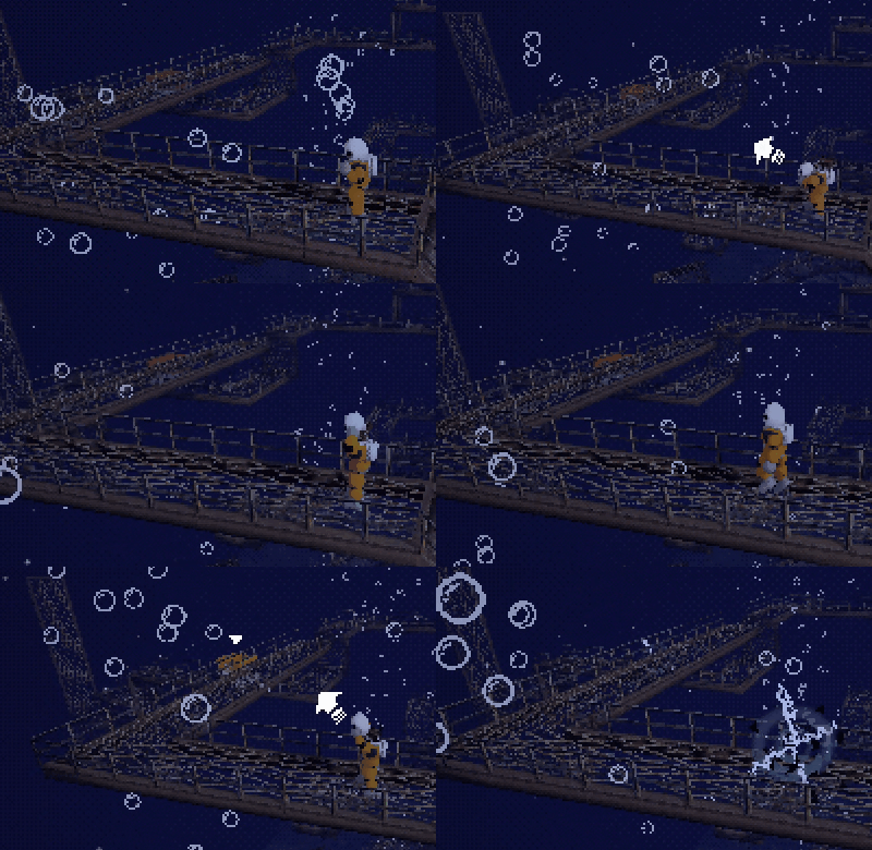
The fix for the first of these issues was to introduce a limit to the distance that you can teleport, and put volumes in the game that change this distance. So, if I discovered that in one of the rooms it was possible to teleport to a block outside the facility, and the closest you could get to that block was about 3,000 units, then I’d set the teleport distance to 2,500 units while you’re in that room. It made designing puzzles a laborious affair, as I had to consider every possible way the player might be able to get stuck. In the end, controlling the teleport distance isn’t a solution that I’m particularly happy with, but it’s the only one I could implement within the game I made. From the player’s perspective, the fact that the distance they can teleport isn’t consistent must be frustrating, as it can lead to situations where you feel like you should be able to teleport to a block (because you could teleport that distance earlier in the game), but you arbitrarily can’t this time. And if you take a couple of steps towards it, suddenly you can. I’m not happy with this.
The distance the player can teleport can feel arbitrary.
The fix for the second of the two issues mentioned above was basically to make sure that the camera angle always allows the player to teleport to things they need to teleport to, which again was labour-intensive. As with most things in the game, I used invisible volumes to change the camera settings, so I simply had to look for all the possible ways to teleport somewhere that left me stuck, and then change the camera settings accordingly. Again, this is not ideal, and there’s no way of being sure I’d caught all of the edge cases.
The way I see it, if I’d designed the game with the teleportation mechanic in mind from the start, it would be entirely 2D instead of 2.5D, and most likely room-based. This way, the relevant blocks are always on-screen, and you can always teleport back to them. I think it would have given me a lot more freedom to explore the mechanics and find the most interesting puzzles, as opposed to trying to figure out what fits within the constraints of the facility that I had already largely made.
An overview of the Rooftop Platforming section.
The one exception to this is the large, abstract platforming section on the roof, where I basically had free reign to design the puzzles however I wanted. Even this ended up feeling a bit under-baked though; there are three blocks that you need to bring to one location to reach a switch, and one of them requires solving a moderately interesting puzzle, while the other two mostly just require you to push or drag them, and occasionally teleport them. I did get to revisit this area in a secret mode and created a few more substantial puzzles, but most players won’t see them, and I think those that do are a little tired of the mechanics by that point. So my general feeling is that the puzzles needed a lot more iteration and testing to make them something you could build a game around, and the way I developed the game didn’t really allow for that.
Some Positivity
To counter what has largely been negativity about the design so far, I do want to cover some of the things that I think I did well. The main strength that gets mentioned is the game’s atmosphere, which I worked hard on, and which I believe does a good job of carrying it even when the horror elements start to fall a little flat. A lot of this is because I was less interested in making a straight horror game than I was in making a game that makes you feel like you’re at the bottom of the ocean, in a place that feels strange and unknowable. A lot of the heavy lifting is done by the PS1-style visuals, evoking an era that is by this point something of a cliché in horror games, but which I believe still holds a lot of potential when done well. I can’t take credit for all of this, as the shaders I used for dithering and texture/vertex wobble were made by Jazz Mickle and Lilith Walther respectively, but I’m really happy with how my environment and character models feel authentic even while the lighting model doesn’t. Sound also plays a big part in carrying the atmosphere, and a lot of effort went into getting this right, from the breathing sounds that play almost constantly through the game to the 13 different ambient tracks that play based on which area you’re in.
On the subject of audio, I do love the soundtrack that my partner Amy (who also voiced the protagonist) and I created for the game. I started the collaborative process with a video of a full playthrough, from which I created a spreadsheet of all of the areas of the game that I felt needed music, and the general feeling I wanted each piece to have. I then talked her through each of them and showed her the footage of the respective gameplay, based on which she wrote and recorded piano pieces. I then built on the piano, sometimes minimally by just underscoring it with some background synths, but sometimes adding drums, bass and lead synths to make a more structured song. I think this variation helps certain tracks to stand out, as they feel unexpected, and these tend to be the ones that players comment on most often.
I’m also happy with how the narrative came out. Considering I didn’t have an ending to the story in mind when I made the original Game Jam version of the game, I like what I came up with, and people have generally reacted to it in ways that I’d hoped they would. That said, it does feel like the most contentious part of the game, if the negative reviews on Steam are to be believed. I don’t know that there’s a lot I can say about this, as I find it a lot easier to pick apart what does and doesn’t work in game design than I do in storytelling, but I think the fact that it has a fairly ambiguous ending might have something to do with it. Also, without spoiling too much, the unlockable post-game content continues the story in a way that addresses a lot of the criticism that I’ve seen in the negative reviews, but again I can’t really say, “You’re wrong about this!” because I made the conscious decision to gate the majority of players from seeing it.
Also, while the aforementioned rooftop section can be a little slow in its pacing and perhaps doesn’t make the best use of its mechanics, I think I did a good job of structuring it in a way that helps the player understand where they need to be going, and what they need to do. I’ve noticed that players tend to struggle with navigating some of the areas, and keeping track of where they’ve been already. Without the ability to move the camera around freely, this is understandable; it’s then up to me as the designer to control what the player sees in such a way as to make sure they don’t miss important things.
Facing Outwards vs Facing Inwards
One of the three main walls in the Storage room, showing three routes the player can take.
One area that players struggle with is the Storage Room; this has been the case since the very first version I released, and in spite of everything I’ve done since then to highlight the structure of the room and make it clear where the important doors and switches are, more than half of players still take the wrong route at some point. All I can really put this down to is the fact that the camera is in the middle of the room, facing the outer walls, so you’re generally only seeing one wall at a time, and it’s easy to forget how each wall links to the one next to it. At any rate, going the wrong way for a few seconds isn’t a major issue, and in general I’m happy with this puzzle.
Two spots in the Rooftop section where blocks that you might have missed are highlighted.
By contrast, the Rooftop section is similarly square/circular in its structure, but this time the camera is outside pointing towards the centre. This means the player sees both where they’re going, and where they’ve come from, so the relationship between the two is much clearer. This does break down a little when moving between the three different levels of the puzzle, but generally this isn’t a big problem; most players will instinctively make their way to the top, and once they’re up there they get a better sense of what’s on the lower levels, thanks to how the camera is angled down. The area is structured with an elevator that takes the player to a locked door on the bottom level, a puzzle with one of the blocks they need on the middle level, and two more blocks on the top level. If they go straight to the top level, the process of bringing either of the two blocks on that level to where they need to be will point the camera at the block on the level below, which they missed. I’m happy with how this came together, and from watching people playing the game, I feel like it’s working fairly consistently to reduce frustration here.
A lot of how I managed to get to this point was playtesting, something I wish I’d done a bit more of. Once I’d got the layout of the entire game in order and rough ideas of what the puzzles would be (about a year into development, and a year from release) I carried out a playtest with 10 people to get an idea of how the mechanics were being understood, and where the sticking points in progression and the puzzles were. A lot of what came out of this were tweaks to the camera in specific areas to highlight where the player needs to go, but also making sure that things of importance were being lit correctly.
I think this post is already long enough, so I’m going to wrap it up here. The next part will deal with putting the game on Steam, marketing, the reception, and how it sold (spoilers: not great). See you then!


